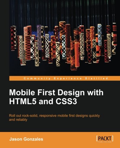
Mobile First Design with HTML5 and CSS3
- Length: 122 pages
- Edition: 1
- Language: English
- Publisher: Packt Publishing
- Publication Date: 2013-09-24
- ISBN-10: 1849696462
- ISBN-13: 9781849696463
- Sales Rank: #6756339 (See Top 100 Books)
Roll out rock-solid, responsive, mobile first designs quickly and reliably
Overview
- Make websites that will look great and be usable on almost any device that displays web pages.
- Learn best practices for responsive design
- Discover how to make designs that will be lean and fast on small screens without sacrificing a tablet or desktop experience
In Detail
The mobile first design philosophy aims to develop websites that will be lean and fast on small screens without sacrificing a tablet or desktop experience. Using HTML5, CSS3, and simple, standardized modern web tools you can make one site to rule them all.
Mobile First Design with HTML5 and CSS3 will teach you the tools you need to make a modern, standards-based web page that displays beautifully on nearly any web browser—essential knowledge for anyone who makes websites!
In this book, you will learn how to set up a project from scratch and quickly get up and running with a full portfolio website that will form the base for making almost any kind of web page. Learn to develop web pages that fit the web conventions we all have to conform to. You will learn how to make responsive image slideshows; image galleries with detail pages; and bold, eye-catching banners and forms. Best of all, you will learn how to make these things fast without compromising quality.
This book will walk you through the process step by step with all the code required, as well as the thinking that goes behind planning a mobile first responsive website.
What you will learn from this book
- Develop web pages that change their layout and respond to different sized screens, so that they display well on mobiles, tablets, and desktops
- Utilize HTML5 and CSS3 to make responsive web pages quickly and effectively
- Use current technologies like LESS and SASS to work fast
- Build web page components that will function well on both small and large screens
- Create and plan designs that work for small and large screens without having to sacrifice content
Approach
A user friendly tutorial to develop websites that work for both small and large screens using HTML5 and CSS3.
Who this book is written for
This book is for beginner to intermediate developers and designers, as well as for those in management who want to understand what is possible with modern tools and strategies on the Web.
Table of Contents
Chapter 1: Mobile First – How and Why?
Chapter 2: Building the Home Page
Chapter 3: Building the Gallery Page
Chapter 4: Building the Contact Form
Chapter 5: Building the About Me Page
Appendix A: Anatomy of HTML5 Boilerplate
Appendix B: Using CSS Preprocessors

Information Architecture and UX Design, 3rd Edition: The Integration of Information Spaces


