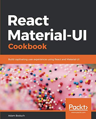
React Material-UI Cookbook
- Length: 534 pages
- Edition: 1
- Language: English
- Publisher: Packt Publishing
- Publication Date: 2019-03-30
- ISBN-10: 1789615224
- ISBN-13: 9781789615227
- Sales Rank: #489954 (See Top 100 Books)
Build modern day application by implementing Material Design principles in React applications using Material-UI.
Key Features
- Grasp the needs React components for UI elements
- Master the style and theme of the tools to go along with these components
- Get to grips with all the React best practices to build a modern application
Book Description
Material-UI is a component library for rendering UI elements, using modern best practices from React and Material Design. This book will show you how you can create impressive and captivating modern day web apps by implementing Material Design considerations. The primary objective of this book is to help you use several Material-UI components to build larger UI functionality. We will also focus on React best practices in conjunction with Material-UI components – using state, context, and other new React 16.8 features properly. This book will start with layout and navigation and then dive into presenting the information with Material-UI components. It will then talk about the different components for user interactions. By the end of this book, you will know how to improve the look and feel of your applications using Material-UI components.
What you will learn
- Learn to build the overall structure and navigation for your Material-UI app
- Learn to present simple and complex information in a variety of ways
- Build interactive and intuitive controls
- Design portable themes and styles for all of your Material-UI apps
- Group content into sections using tabs and expansion panels
- Learn how to design a general page layout with Material-UI grids
- Use lists for complex data, and cards for detailed information
Who this book is for
They are JavaScript developers who have some basic knowledge of React and would want to implement Material Design principles in React applications using Material-UI. The reader wants to build a user interface using React components but doesn’t want to invent their own style or UX framework.
Table of Contents
- Grids – placing components on the page
- App bars – the top level of every page
- Drawers – a place for navigation controls
- Tabs – group content into tab sections
- Expansion panels – group content into panel sections
- Lists – display simple collection data
- Tables – display complex collection data
- Cards – display detailed information
- Snackbars – temporary messages about what just happened
- Buttons – initiating actions
- Text – collecting text input
- Autocomplete and chips – text input suggestions for multiple items
- Selection – make selections from choices
- Pickers – selecting dates and times
- Dialogs – modal screens for user interactions
- Menus – display actions that pop out toward the user
- Typography – control font look and feel
- Icons – enhance icons to match your look and feel
- Themes – centralize the look and feel aspects of your app
- Styles – apply feature-specific styles to components


